Omicron-Social-Listening

Sociography: How our tweets about COVID speak about us.

Tweeting about the Omicron variant says much more than people thoughts on the subject. Once again, a new SARS-CoV-2 variant has appeared -please, someone makes this running gag cease- and just like each past times, it mechanically skyrockets the number of tweets related to it. The socio-psychology geek I am thought this happening would be a good occasion for doing some sociography. In this article I suggest we see together how your social interaction network about a simple subject can be used as a profiling method, using scientific tools and the example of the Omicron variant.

Disclaimer: Some tweets monitored here feature political content. The aim of this article isn’t to pick a side but to analyse social dynamics based on data science tools.

1. Basic understanding of a sociogram. 2. Tweeting about Omicron betrays people political orientation. 3. Tweeting about Omicron betrays people relationship with science. 4. Tweeting about Omicron betrays people network of friends, possible alliances and antagonists. 5. Any communication opportunity we can withdraw from this sociogram  ?

1.

Basic understanding of a sociogram.

1.1.

Birds of a feather flock together.

From far away, a sociogram looks like a painting from Jackson Pollock, except it doesn’t worth $140 millions and its author won’t get a biopic. A sociogram is helpful to understand relationships between people and even to identify individual characteristics, as our social network can be symptomatic of who we are. Before we dive into sociography, you need to be introduced to one basic concept of social psychology: People share attributes similar to those of their friends. There are two underlying reasons for this. First, because one individual will adopt behaviors exhibited by those they interact with [1], this is a phenomenon known as “social influence”. Second, because people tend to form relationships with others who are already similar to them. This is often termed “social selection” [2,3]. Keep that in the back of your mind for what follows.

1.2.

Reading a sociogram.

All sociograms are made of “nodes” and each node embodies an individual. Those nodes are linked together by what are termed “edges”. Sociograms can be interpreted thanks to the none exhaustive list of following metrics:

• Size: Designates the number of nodes in a given network. For example, the overall size our current sociogram about Omicron is 14.159 nodes.

• Homophily: Designates the extent to which members of a network share similar or dissimilar attributes. Homophily in the sociogram we will see can be identified thanks to the color nodes have. Two nodes having the same color belong to the same cluster. In marketing we sometimes refer to clusters by the name of “tribes”. Quick notice: the grey color doesn’t stand for any community. Grey clusters are just various communities I chose not to pay attention to in this article.

• Propinquity: Designates the psychological closeness of two nodes. Two nodes with different colors but close together belong to different tribes or clusters, but they coexist together.

• Centrality: Designates the level of influence of a node or a cluster. In the coming sociogram we are about to discuss, nodes centrality is represented by how big they are. The larger is a node, the more it has influence over its environment. When a node is exceptionally big and it centralizes a lots of of edges, it is named a hub.

Each of those metrics could be studied more deeply, but let’s keep it simple. Now, we will use this to interpret our sociogram with people tweeting about the Omicron variant.

2.

Tweeting about Omicron betrays people political orientation.

Here is how the overall network map looks. Just as explained before, each color symbolizes a different cluster, or “tribe”. And the proximity they share with other clusters stands for their psychological nearness (their propinquity).

Omicron-Social-Listening

Those red, pink, yellow and orange clouds articulated together are four different communities, but despite their differences they share a lot of similarities and they interact together. If I were J.R.R. Tolkien, I could probably name this social area “the valley of the American conservatives”. Indeed, in this part of our graph all individuals are both American and right wing oriented. The red hub you see is gun activist/pro-Trump/republican party member Lauren Boebert. She and her community are surrounded by a yellow cluster led by three main hubs: @goodblackdude, @Shawn_Farash and, @Sassychickie. Unlike the red one, the orange cluster isn’t political institution based, it is grassroot based. One other specific attribute of this orange cluster is to be much more openly anti-mask, anti-vaccine, pro-conspiracy and/or anti-left wing.

Omicron-Social-Monitoring

Now let’s draw our attention onto the pink community. Major hubs in this cluster include @disclosetv, @newsmax, @Liz_Wheeler or @BryanDeanWright. This pink cluster is the sphere of those we could name the professional political commentators. They aren’t grassroot movements and they aren’t governmental entities. They are a sort of in between category of individuals closer to an elitist grassroot segment, while the orange cluster appears to embody lower classes.

Now, let’s move to the right upper side of the sociogram. The biggest hub in this blueish nebula is liberal prime minister of Australia @ScottMorrisonMP. You might wonder: “he is conservative, christian, liberal, why isn’t he at the left of the sociogram with others?”. There are two reasons for that, you will find the first one in part three of this article. The second reason is that this cluster is an Australian cluster. American political sphere appears to have very few connections and exchanges with Australian one regarding this subject.

Finally, let’s have a look at the bottom of the sociogram. What is this purple and isolated constellation? The hub this cluster folds around is @JoshuaPotash who’s twitter bio is “Earthseed | Abolition | Anti-capitalism |”. No wonder why this cluster is so far away from any conservative or liberal node.

3.

Tweeting about Omicron betrays people relationship with science.

We didn’t analyze the green clusters in the middle yet. These aren’t strictly political related communities. They are scientific related communities. In fact, if I were J.R.R. Tolkien, I would probably name this social area “the middle bay of science”. At the center of it all is the main hub: the World Health Organization. Other major hubs in that green cluster include researchers and professional scientific entities such as @PangoNetwork, @nextstrain, @EricTopol or @trvrb. The more we go on the right to that cluster, the more it turns out to be strict science. The more we go to the left and the more it is politically engaged, but still science-based (until we leave the green area).

Omicron-Sociogram

On the right to that green cluster is another sea foam green web. It is still science based, but it seems to be more into scientific popularization and medias. The biggest hub in this cluster is @DrEricDing.

If we look closely, we can see that American conservative clusters are only weakly linked to the most salient hub in the science cluster (the World Health Organization). Unlike Australians, American conservative communities share no connections with nodes in the science community other than W.H.O. A major outcome we can report from here is that American conservatives and the science community weakly interact together. This might also explain the presence of the many conspiracy theorist nodes enveloping the left side of the sociogram.

In fact, the science cluster is quite isolated in this sociogram. There are very few direct connections between important science hubs and political hubs. Only weak nodes establishing indirect bridges between clusters. This means that most people do not base their assumptions on scientific facts but they do it based on what they eared about scientific facts.

4.

Tweeting about Omicron betrays people network of friends, possible alliance and antagonists.

The Australian and the American clusters are very interesting to compare. The first one is homogeneous and the second is very polarized. Having a shattered network of nearby clusters like this can be both an advantage and a weakness.

An advantage because you know where to find your allies in order to build a punctual synergy together. A weakness because polarized networks of clusters are easier to collapse from the inside. Simply suggesting an “us” and a “them” in individual minds composing a group a allied clusters is already enough to trigger ethnocentric behaviors likely to destabilize an cross-cluster synergy. In social psychology, this phenomenon is termed the “minimal intergroup situation” [4].

For example, we could stimulate conflicts between the orange and the red cluster by arousing individual mindset such as “we (orange) are grassroots and they (red) are technocrats” or by spreading rumors opposing those two clusters.

5.

Any communication opportunity we can withdraw from this sociogram?

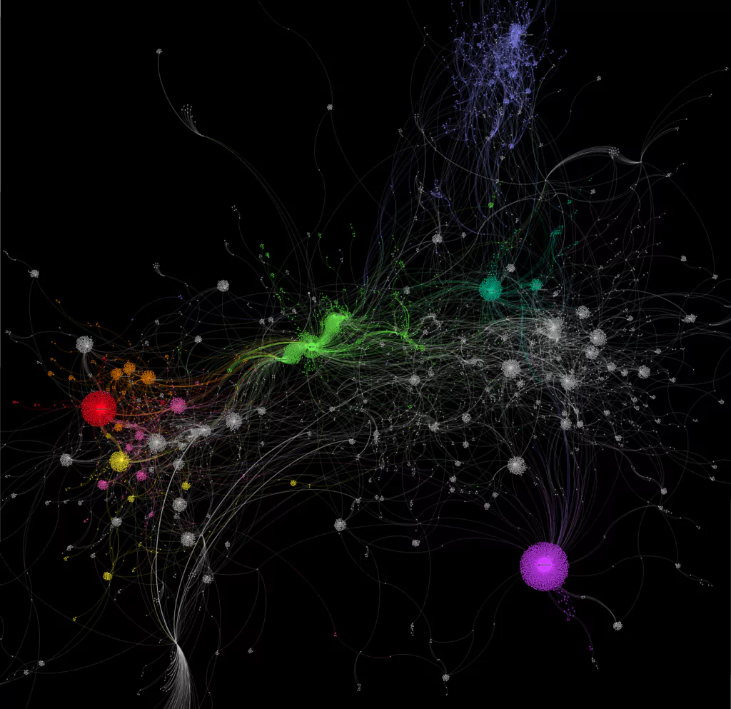
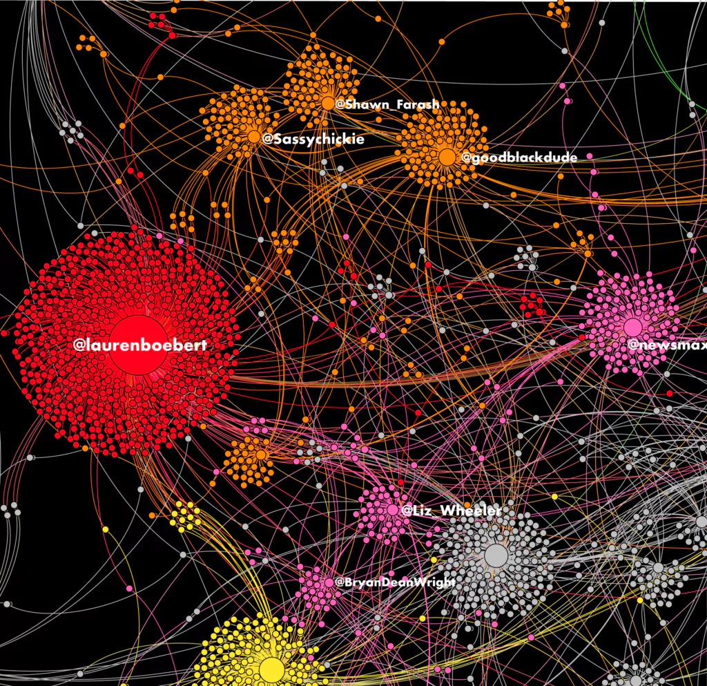
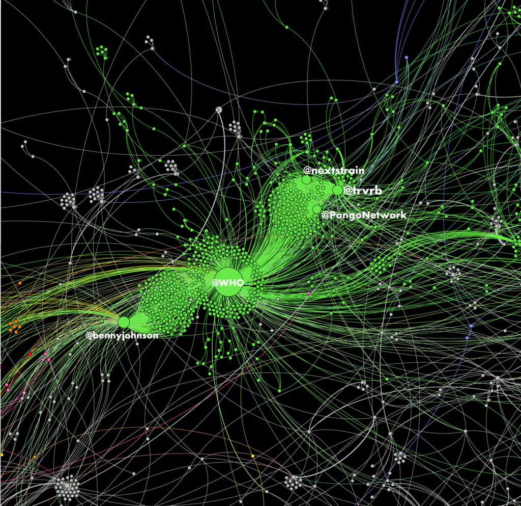
There is a lot more to see but based on what we just analysed, there are some pieces of clue about strategies to set. A first opportunity we could study is that people are weakly exposed to actual scientific discussions.  Because there is a lack of direct connections between members of communities and the science sphere, we might observe skeptical or maladaptative reactions toward scholars knowledge. This also suggests that people network structure makes it so they are told what to think but not the reason why they should. This setting of indirect bridging might participate to a deterioration of the actual messages coming from scholars. It can be caused by all sorts of reasons: science isn’t sexy, the scientific message is immediately reoriented as a political argument before it arrives to the final target in its most objective form, etc… Thus, a first strategic orientation would be to reduce that number of indirect bridges between scientific nodes and the audience or even to convert them into direct edges. Another -more obvious- strategy would be to weaken edges between conspiracy theorist nodes and political nodes. By exploring applications of the minimal intergroup situation explained before we could shatter the stability between the conspiracy cluster and the conservative cluster. However, this strategy has some numerous limits that we won’t detail here.

Finally, it is necessary to acknowledge that this sociogram contains some biases. If we weren’t drawing such a map for the sake of a simple exemple, I would recommend to analyse only one market and avoiding to mix up Australian and American communities. Or else, if we really desire to observe a worldwide dynamic, this sociogram should be supported by a very larger sample of tweets.

Then, even though we are able to conclude who talks with who and to which extent, we are not able to identify the exact content of their discussions. This requires a semantic analysis based on tweets we identify (maybe a subject for a new article 🤔)

Bibliography

[1] Friedkin, N. E. (1998). A structural theory of social influence. Cambridge University Press.

[2] Lazarsfeld, P. F., & Merton, R. K. (1954). Friendship as a social process: A substantive and methodological analysis. Freedom and control in modern society18(1), 18-66.

[3] McPherson, M., Smith-Lovin, L., & Cook, J. M. (2001). Birds of a feather: Homophily in social networks. Annual review of sociology27(1), 415-444.

[4] Brewer, M. B. (1979). In-group bias in the minimal intergroup situation: A cognitive-motivational analysis. Psychological bulletin, 86(2), 307.

victor@strategicplanner.be

Leave a Reply

Your email address will not be published. Required fields are marked *